Email Design 101: Best Practices to Optimize for Mobile-Friendly Emails
It's no secret that we are all increasingly checking email on our phones. And while the number of digital messages sent is also increasing, the time spent reading an email is decreasing. Both trends indicate the need for succinctly optimized messaging to take full advantage of email revenue opportunities—which are indeed only growing!
How to do this? Design your assets with mobile optimization in mind. Use direct language and focus on one primary action you want your audience to take. If you have a wall of text, consider eliminating what's unnecessary or land readers on a blog page (like this one) to read the full story. Utilize headlines, color, bullet points, or line breaks as needed to be on your way to a mobile-friendly read.
PART 1: IMAGES
Compress Your Images
Most email service providers will only accept images under 1MB, and mobile images that are no wider than 600px. If you're having trouble with file size, upload your image to a compression site such as tinyjpg.com, then check that the output meets your quality standards before importing the optimized file into your email.
Enhance Your Branding with Images
ESPs such as Klaviyo and Mailchimp (and many others) allow you to place live text over an image you've brought into your email template, not unlike how most websites process images and text. In the context of email, there are pros and cons to this approach depending on your needs.
First, the PROs...
Your text and the image it sits upon will be responsive, meaning it will adjust to whatever format (or device) it's being displayed on. It also ensures that even if an image won't load, the live text will still be displayed since it’s not embedded within the image itself. Live text is copy that’s contained within the email's HTML code and should be the primary way to input copy into your email, usually through a text content block.
And, the CONs...
You don't always have full control over how the image and text look in relation to one another as it's dependent on the size of the user's device they view your email on. Because of this, you're limited on what image you can use to ensure important areas of the image are not cut off or obscured by text depending on how it displays. You may not be able to take advantage of your brand fonts since the email hosting provider will display web fonts only—unless a user has your font installed on their computer.
On the other hand, creating email graphics within design software utilizing your brand fonts allows you to highlight the hero copy while keeping your branding on point. Opt for concise copy and always remember to include ATL text on each image.
Above: A mix of live text and brand fonts within images for two Spoonflower emails.
In the Artist Spotlight example on the left, the promo banner and the Artist Spotlight headline text are flat graphics. Everything underneath is live text which allowed me to link several artists’ design collections easily.
In the family heirloom project on the right, the hero image works really well using Spoonflower’s brand fonts. Since the quote below is quite long, I opted for live text here. One downside, you don’t have total control over how the live text copy shows up, and in this case, leaves the word England dangling off on its own. A small price to pay, even though the designer in me may be totally wincing.
Adding ALT Text
No matter what kind of image you use, including ALT text serves two purposes. For one, it's the fallback text if an image doesn't load, or if a user prefers no images (it does happen). Second, it's a matter of accessibility for those using assistive screen readers. When writing your ALT text, include all of the copy the image holds and describe the contents of the image itself.
Note: Images imply there is something to click on, so include the CTA in your ALT text.
ALT text example:
20% Off Home Decor Through Monday* | Click to Shop Now [Image description: A pile of fluffy pillows in an assortment of bright colors including blue checkerboard, yellow flowers, and soft green palm leaves. A smiling woman with curly red hair lays on the pillows holding a daisy in her hand.]
PART 2: DARK MODE
Whether it's to prevent eye strain or is simply a matter of personal preference, Dark Mode on mobile (and desktop) is the real mortal enemy of an email designer. Ok, slight exaggeration, but it sure feels like it sometimes!
There's a whole rabbit hole you can go down depending on your level of comfort with HTML which you can read about on many websites, including Litmus. For the sake of the independent business owners who are DIY-ing their own emails, I'll share a few easy tips you can tackle with no coding skills required.
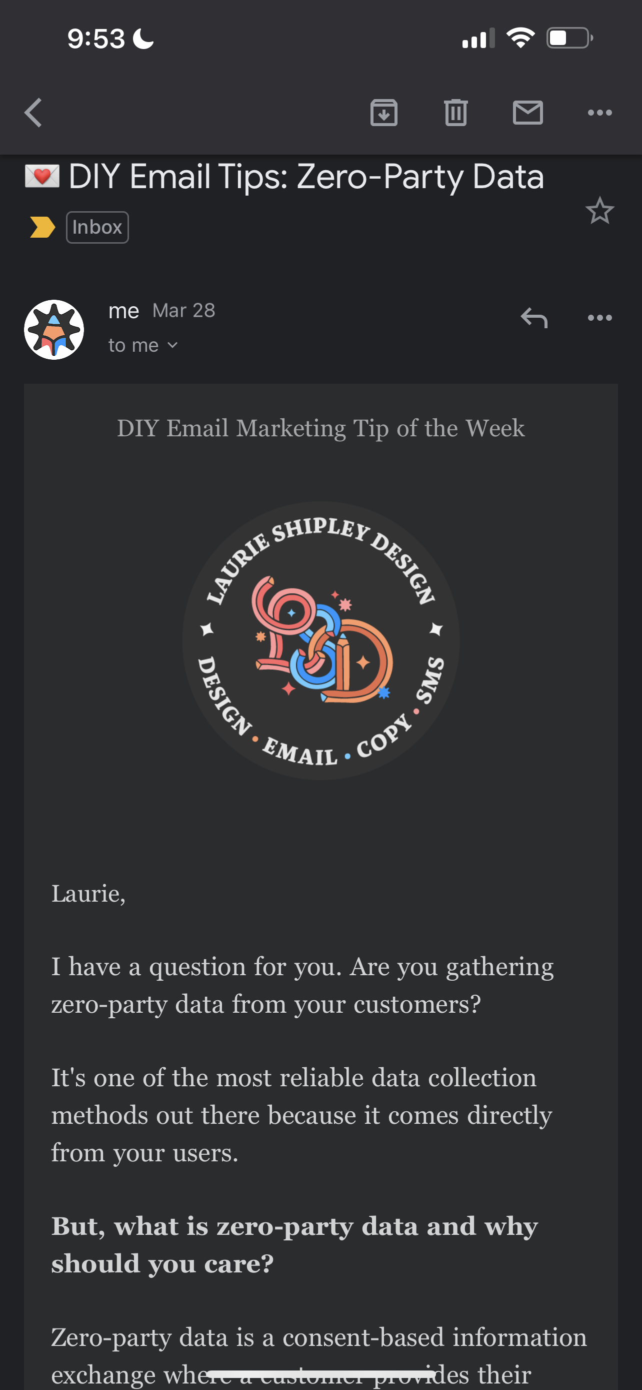
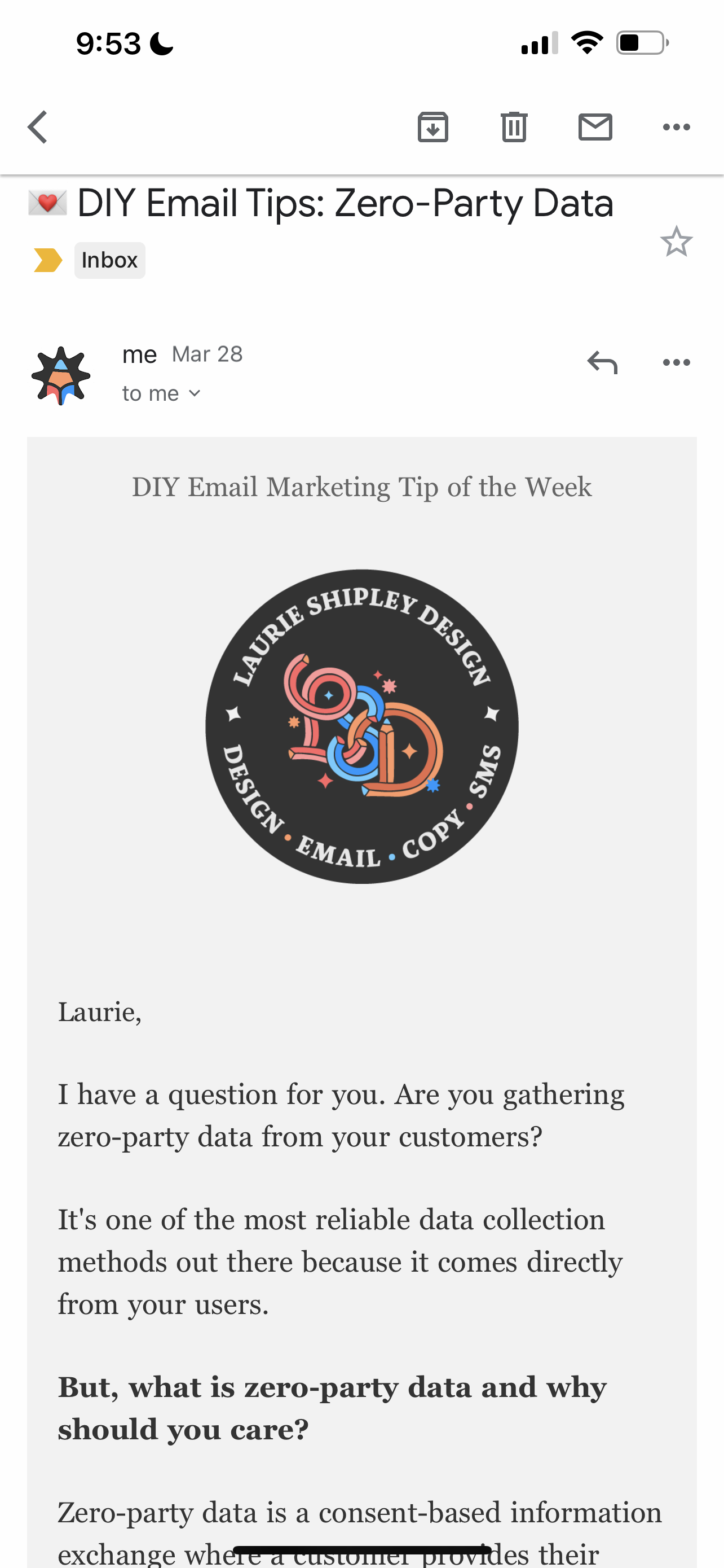
Above: Examples of the same content displayed on mobile in both Dark and Light Mode.
PNG vs JPEG
Save your logos in PNG format to preserve the transparency of the background behind your logo. You can see in the example above, I display my logo on a circular dark background so it shows up exactly that way no matter which mode my subscriber uses. I saved my file as a PNG so the background is transparent, preventing a white bounding box to show up which happens if you save your file as a JPEG.
This may take some experimentation, but test your logo to see what it looks like in both Dark and Light Modes within your ESP, then make small adjustments to get it right. You may want to add an outline or drop shadow to help your logo stand out on both—or you can add an intentional shape as I did.
Text and Background Colors
This goes without saying, but before you even get to the step of importing your brand colors into your email service provider, you want to ensure you or your logo designer pick colors that pass accessibility and legibility standards for all users. Use webaim.org to help you.
Since your colors will be inverted in Dark Mode, you have the added step of ensuring your color choices that include text are accessible to everyone in both modes. It may not always be perfect, but it's something to be mindful of and strive to improve.
PART 3: COPY & MESSAGING
Subject line and preheader
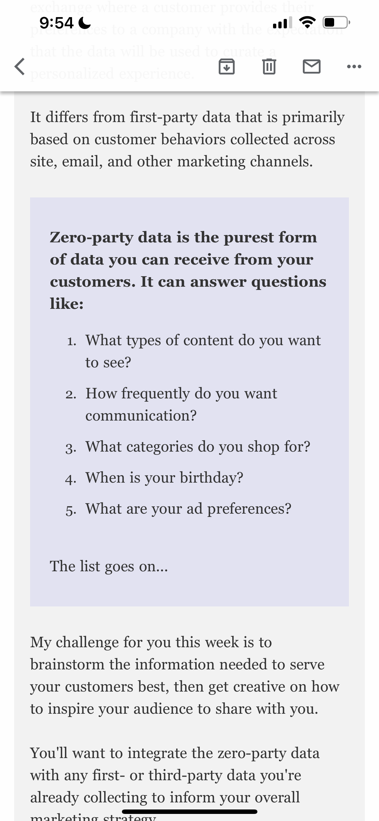
Aim for short and sweet and stay under 30-50 characters for subject lines and preheaders. That way, your message won't be cut off when people view it on mobile. Additionally, Mailchimp finds that subject lines with fewer than 9 words tend to perform better.
If you need more than 30-50 characters for a subject line, consider breaking it into two by utilizing your preheader. Alternatively, your preheader should tease your sub-content.
Hero Content
With only seconds to grab your reader's attention, your primary message needs to be clear and prominent. And for mobile, check that your headline message shows up without having to scroll—it should be said in only a few concise words.
Above: Adobe, All Trails, and Really Good Emails are doing an excellent job at highlighting their primary message for viewing on mobile.
If you include sub-content with a second CTA, you can experiment with adding a final banner or CTA under the sub-content to reiterate the primary message.
Newsletters
Email marketing is about more than sending out newsletters. That said, when you do send them, think about breaking up the text by utilizing headlines, color, bullet points, or line breaks as needed to be on your way to a mobile-friendly read.
Testing
As always, it’s imperative to test various messages and formatting for mobile to find out what works best for your customers. Stretching your tests out over the course of a few months will give you the most reliable results. Don’t give up with just a series of A/B tests though, continue with multivariate testing as you continue to learn what does and does not work for your audience.
